Annual reports are long documents with detailed company information, which includes financial statements and achievements for the year, that are required for stakeholders.
However, with a killer design, an annual report can serve a greater purpose to become a good marketing tool and a compelling tale of your company.
A good annual report design is like a good website design – it presents information in a more digestible format and provides an amazing user experience.
To help you with your annual report crafting, here are six annual report designs that you should learn from:
Digi

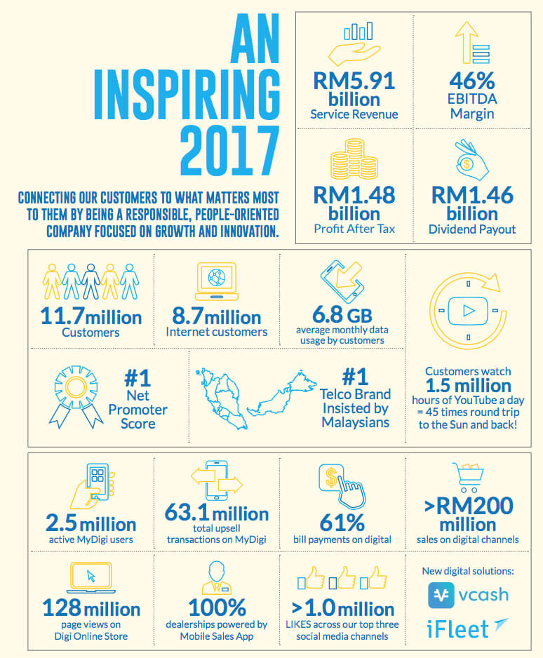
Digi, a telco company in Malaysia, created a vibrant annual report last year while utilising its brand colours admirably. (Of course, the brand colours helped.)
Throughout the report, data was presented with embodying icons and vectors as opposed to the usual cold, hard numbers.
There were also timely breaks from paragraphs of words with clean visuals and designs that complemented them.
A fitting design for a company aiming to be a digital life partner.
Oxfam

Oxfam is a non-profit organisation known for its fight against poverty around the world.
However, in 2015, they designed a refreshing annual report that aligned with its branding and its humanistic elements.
The high-quality photography featuring personalities and capturing realistic scenarios provided a strong human connection in the report.
It feels less wordy because of regular visual breaks, with images in chapter transitions and humanistic story features.
Simple, clean and readable – a good tackle on the annual report design.
Carlsberg Malaysia

As a part of a relatively exciting industry, Carlsberg delivered in 2016.
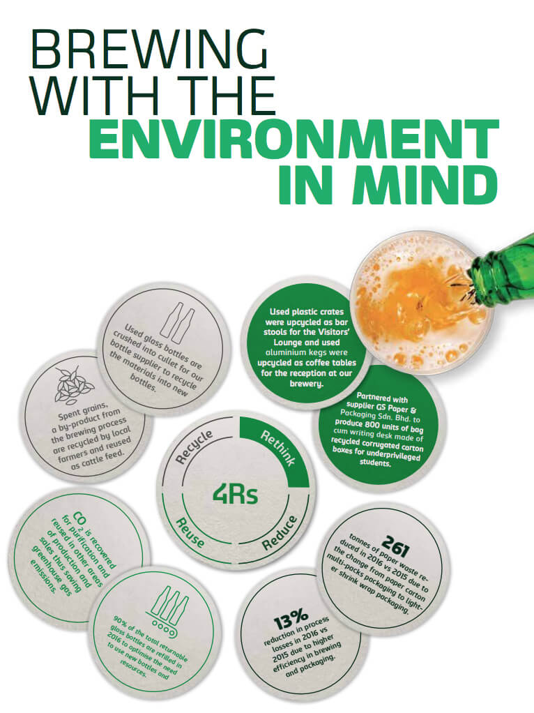
Using creative and industry-relevant designs, it displayed information and data in a refreshing manner befitting of their products and brand.
The branding colours applied were welcomed breaks within chunks of words and provided some variations comfortable on the eyes.
Good annual report designs include creative copywriting as well, and the copywriting for the headers and chapter dividers showed considerable thought put into it.
Cheers to an exemplary annual report!
Getflywheel

A unique take on annual reports, this website hosting agency relied on their strengths to create a visually exciting design.
Using a microsite to replace their annual report, Getflywheel delivered with animations to portray boring figures.
Bright colours and conversational-styled copywriting added to the entire annual report experience for readers as well.
The report complemented the entire brand experience and made a generally boring service exciting.
Befitting of a rapidly growing company.
Telekom

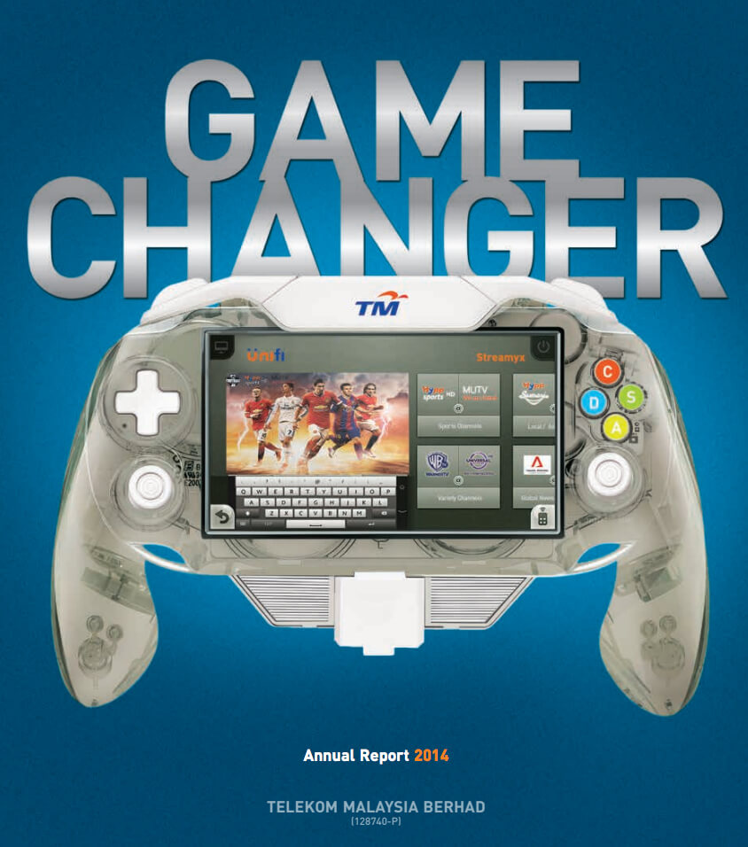
This may be the wordier entry in this list, but this annual report won the Overall Excellence Award during the National Annual Corporate Reports 2014.
And for good reason.
Consistent brand colours and regular breaks in wordy paragraphs, the annual report was easy on the eye and ahead of its time in presenting data and figures.
Clear sections and well-chosen images and colour palettes enhanced Telekom’s branding.
A game-changing annual report for the Asia-Pacific Region indeed.
Chartered Professional Accountants Ontario

Accountants are not known for their flair in design but CPA Ontario impressed with a compelling annual report in 2015.
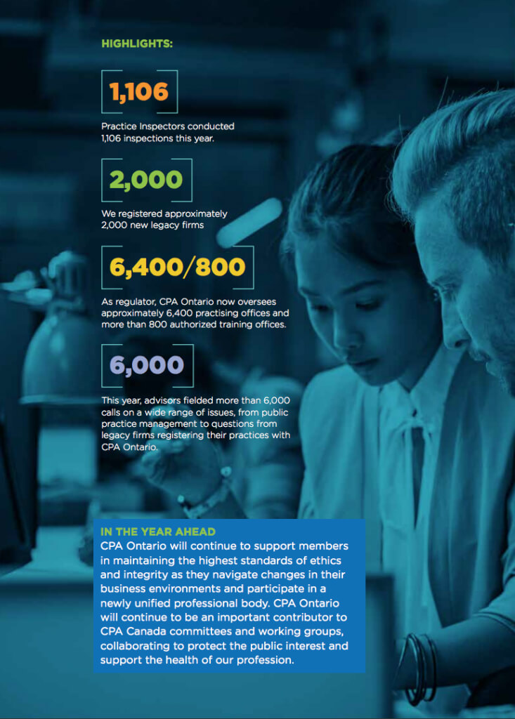
Pairing good contrasts of colours with well-chosen photography in a short and succinct report, these accountants crunched the numbers and presented them nicely.
The annual report catered to both the old-school investors and new-school average users with both PDF and microsite formats.
Summarised huge chunks of facts into key metrics and figures within each section’s overview, it created an easy and fast read.
Perfectly exemplification of its vision as a multi-dimensional role.
Annual reports can be difficult to design, so consult a creative team to push out an annual report that can double as a marketing asset.


