As we ease ourselves into 2019, we couldn’t help but notice the plethora of website designs that have surfaced in the past months. With the abundance of information, good web design examples and website design tips found online, it is easy to identify the trends that can be adaptable across different brands.
In this digital age, identifying trends is important for any brand and this is even more evident in website designs. Users are exposed to countless online content daily – being behind the times or outdated affects your website’s user experience.
Hence, to help you to improve your website design, we’ve sniffed out some prominent trends that you can learn from:
Incorporating Animations in Web Designs
Besides adding the fun factor to websites, animations encourage user interactivity and improve user experience. Websites work as an entry point for potential customers and it should strive to make a great first impression. Essentially, a website should aim to retain web visitors’ attention to avoid a high bounce rate.
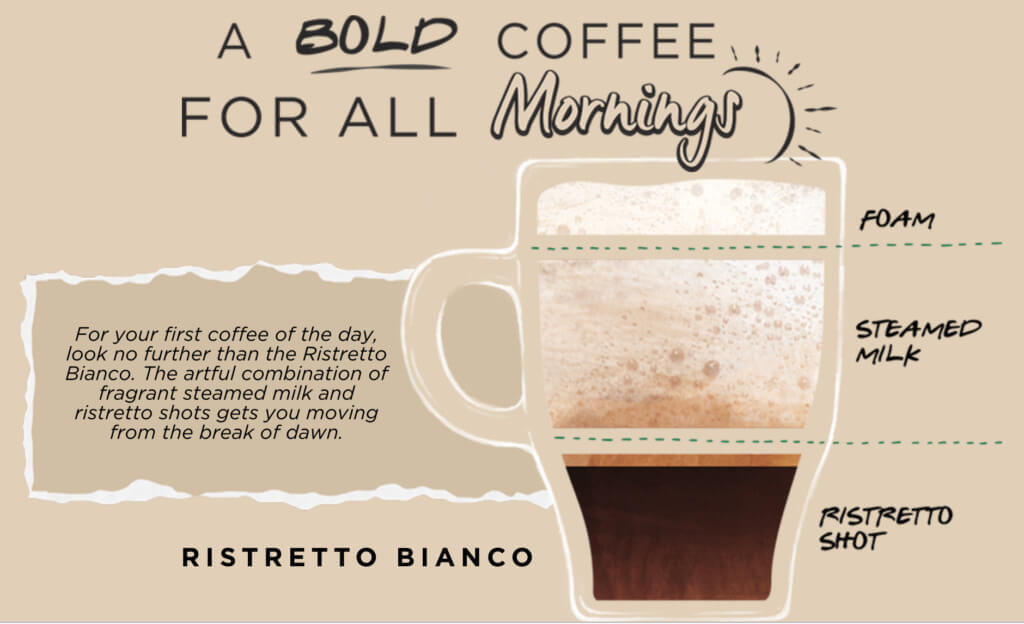
Here’s an interesting example by Starbucks Singapore, which encompasses a great usage of colours, varying fonts and creative enhancement of visuals with animations to direct the focus of the content.
Upon arriving on the landing page, a flickering image of a mouse directs users to scroll for more content. Scrolling further then reveals more animations of different drinks and ingredients. This allows users to be inclined to find out more information and explore the page further.
Depending on your company’s products and services, web design gives you the fluidity to express your brand in the way you wish to.
Making it Mobile Responsive
The mobile penetration rate is expected to reach 63.4% in 2019. Hence, creating a website that mobile users can access easily, can generate traffic and reduce bounce rates.
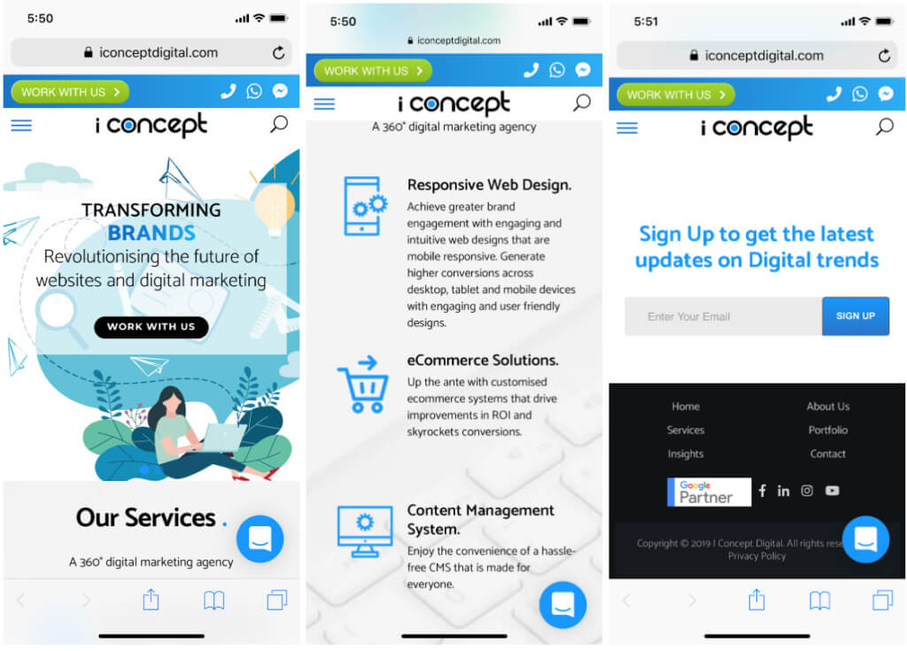
Mobile responsiveness ensures the text and images are scaled according to the users’ screens, making the interface and experience smoother for the users. Hence, being accessible via mobile means your audience will be more willing and more likely to stay on your website.
Mobile will only continue to be prevalent in our society so if you haven’t made your website mobile responsive, reach out to experts to set-up a beautiful yet mobile-responsive website of your own.
Infusing Strategic Copywriting
With web design, comes website copywriting. They work hand-in-hand to produce the ideal user journey and desired end results. Effective web copywriting complements the great design and vice versa.
To have strategic copies, you have to first identify the user’s intention. Then think about the ways you want to keep them interested and ultimately, commit to the desired action.
Think functional, yet smooth so that it becomes clear and simple enough for anyone from your target audience to navigate through. Here’s a crowd favourite from the Malaysia Website Awards 2018, Big Ads Creative which portrays a clever usage of web copywriting:
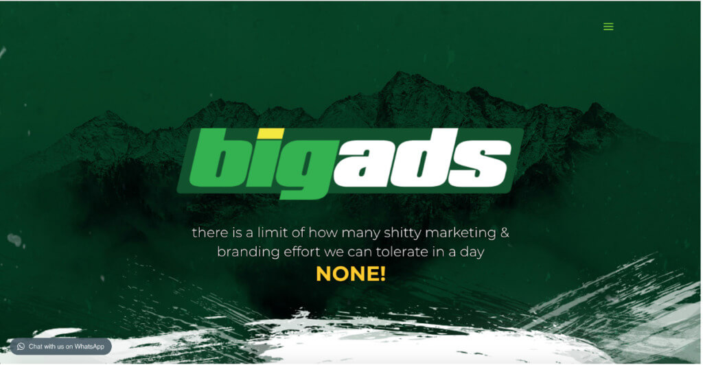
It’s clear that they do digital marketing, but with a tinge of wit and fun at the same time.
Wishing to communicate to your audience effectively? Seek out professionals who can communicate your branding.
Utilising White Spaces & Minimalistic Design
Minimalistic aesthetics never fail to impress. If having conservative visuals is what makes your brand stand out, don’t be afraid of using it.
With a minimal selection of colours and text to display, the design will bring out the essence of your brand’. Instead of exploring complicated visuals, play around with animation for your website to stand out more.
Check out Basic Culture’s cool and tactical usage of minimal colours with animated effects to better enhance the user experience:
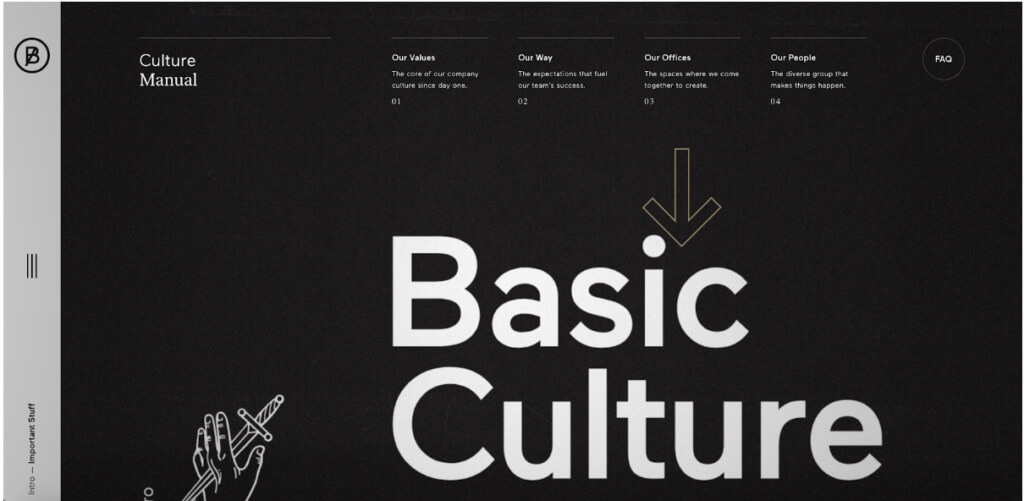
White spaces are essential in websites, as it allows easier readability and makes a website more coherent with clear segmentation. Remember, less is always more!
Convenience of Chatbots
Adopting a chatbot for your website can serve to save time and effort. (We are also guilty of utilising this useful marketing tool.) Brands like Sephora Singapore have adopted chatbots for customers to enquire burning questions they may have, instead of going down to the physical stores or calling the hotline for help.
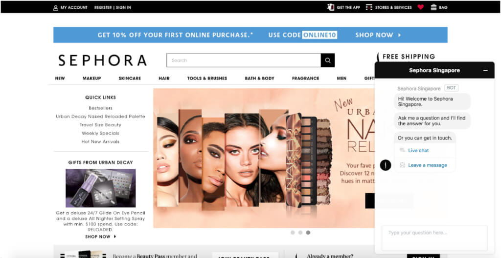
Chatbots have become a thing of today. With the ever-changing shift in consumer trends and behaviours, brands have to constantly upgrade our marketing tools to cater to them accordingly. People want information as easily and quickly as possible. And chatbots have proven to fit the bill for quick and accessible problem-solving.
Usage of Interactivity
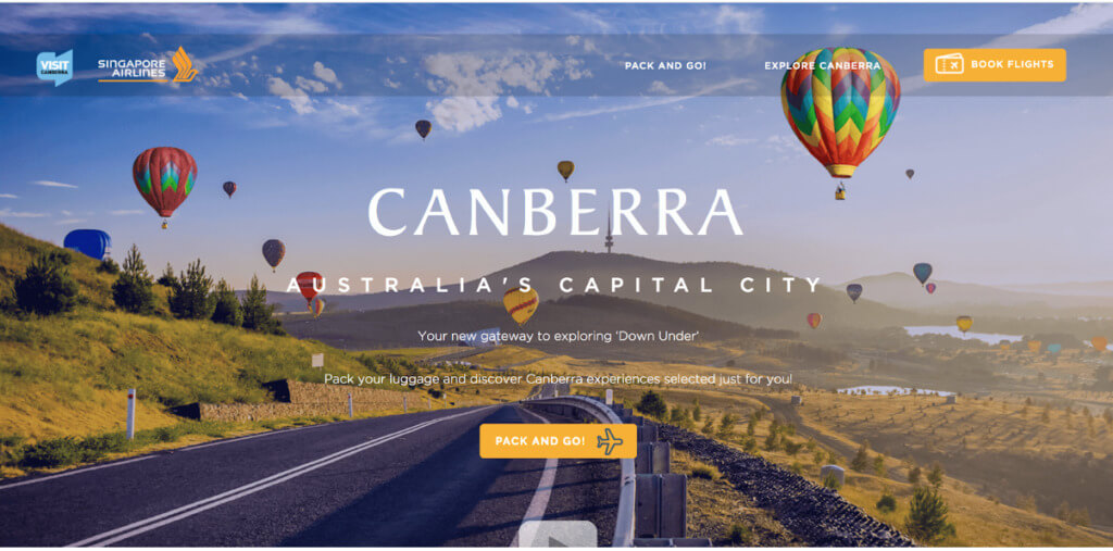
Interactive websites are a whole lot of fun. The Singapore Airlines microsite is a fun example of interactivity via a travelling quiz, with the user experience fully optimised throughout.
Thereafter, users were directed to find their ‘perfect’ destination and subsequently towards itineraries which maximise a user’s attention.
Quizzes are just one of the examples of interactive websites, and there are more interactive elements that can improve your website.
Conclusion
First impression matters and your website is the “face” of your brand. Hence, it will decide how your audience will eventually view you, and it should leave your consumers coming back for more.
A great website can build trust, which essentially produces revenue and growth, with a good interface.
Looking to invest in creating a trendy website of your own? Consult web design experts to dish out a strategic web plan just for you.
Table of Contents
Incorporating Animations in Web Designs
Making it Mobile Responsive
Infusing Strategic Copywriting
Utilising White Spaces & Minimalistic Design
Convenience of Chatbots
Usage of Interactivity
Conclusion


