4 Best eCommerce Website Designs That’ll Get You to ‘Add to Cart’ - I Concept

Now that
you're here...

Tell us what you need and let's craft your story together.
Let's Go!

01 - 05

01/05

How can we help you?

Corporate Website

eCommerce Website

Video Production

Marketplace Portal

Customised System

Annual Report
Design

Digital Marketing
Solution

Next

02 - 05

02/05

What is your objective
for this project?

Enhance corporate identity and brand awareness

Improve user experience & web features

Implement new marketing strategy

Corporate Video

Promotional Corporate Video

Online Commercial

Training Video

Recruitment Video

Product Launch Video

Consumer Testimonials

Corporate Documentary / Behind the Scenes

Design

Copywriting

Proofreading

Printing

Photoshooting

Director's interview

Drive traffic

Increase sales

Increase brand value

Increase social engagement

Increase sales leads

Increase subscribers

Other

Next Back

03 - 05

03/05

What is your overall budget?

Approximate Budget

RM 50k - 65k

RM 65k - 80k

RM 80k - 95k

RM 95k - 110k

More than RM 110k

RM 50k - 75k

RM 75k - 90k

RM 90k - 105k

RM 105k - 130k

More than RM 130k

RM 100k - 125k

RM 125k - 150k

RM 150k - 175k

RM 175k - 200k

More than RM 200k

RM 30k - 60k

RM 60k - 100k

RM 100k - 150k

More than RM150k

RM 100k - 125k

RM 125k - 150k

RM 150k - 175k

RM 175k - 200k

More than RM200k

RM 50k - 100k

RM 100k - 150k

RM 150k - 200k

More than RM200k

RM10k - 15k per month

RM15k - 20k per month

RM20k - 25k per month

RM25k - 30k per month

More than RM30k per month

I'm not sure yet
Next Back

04 - 05

04/05

How ready are you to
engage us?

I'm still exploring and doing some research

I'm comparing quotes before engaging anyone

I'm more than ready, please contact me now!

Next Back

05 - 05

05/05

Tell us more about you!

Get Started

All fields marked with an asterisk (*) are mandatory.

View Summary
Send Now Back

We are ready to
serve you.

We're always looking to best customise and tailor-made our services according to your requirements. We will response you as soon as possible.
Back to Home
View Summary

Hi, I'm looking to enhance corporate identity and brand awareness for a/an corporate website with a budget RM 65k - 80k.

I'm more than ready, please contact me now!

Back

4 Best eCommerce Website Designs That’ll Get You to ‘Add to Cart’

29 August 2018

3 mins read

Just when you think you’ve succeeded avoiding that pesky ‘Add to Cart’ prompt hovering out of the corner of your eye – you find yourself getting a 2FA message for “accidental shopping”. We all know that it’s more than the lures of a great product – it’s a wholesome experience coupled with a great website design, simple navigation and ease of use.

And with the eCommerce scene growing 4x faster than in-store retail, the massive influx of online retailers make for a highly competitive environment for brands of varying sizes.

So to give you a head start and get those gears running, we’ve a list of great eCommerce website designs that’ll get you inspired and browsin’!

1. LOQ

Like what you see? Then click away,” is all this website needs to say.
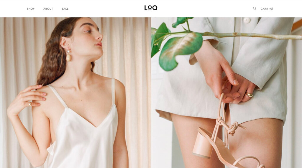
LOQ is the sophisticated brainchild of Karen Longkumer and Valerie Quant, a women’s footwear brand that aspires to redefine the classics for modern day women.

And chic comfort is what LOQ’s all about – with its minimalist layout of wordless, colourful visuals that feature their products and its simple, to-the-point navigation bar, LOQ’s design speaks for their brand in a style that’s no-frill-but-chill.

Which is what makes this brand so brilliant. They know their brand’s purpose and market it well, reaching their target market with a clear message as to what they’re selling.

That’s how they got us to stay and browse anyway.

2. 1-OK CLUB
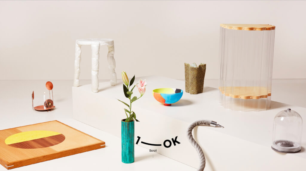
This quirky website practices the saying, ‘what you see is what you get’.

Being a platform for bespoke, functional works, the 1-OK Club uses brightly coloured visuals to ensnare their visitors, getting them to move their cursor along the floating icon and before you know it – Surprise! You’re in their product gallery.

As kooky as this website looks, there’s something to say about their efficiency.

The stories of their eclectic, eccentric items are uncovered only when you choose to click on them, making user navigation feel more cleanly than your average ‘stuff-everything-in-a-single-page’ kind of website.

Remember, while the sky’s the limit and creativity is appreciated, one has to remember the fine balance between ‘abstract’ and ‘too much’.

Less is often more after all. And the best ecommerce websites are the ones that convert visitors to buyers.

3. Bold and Noble
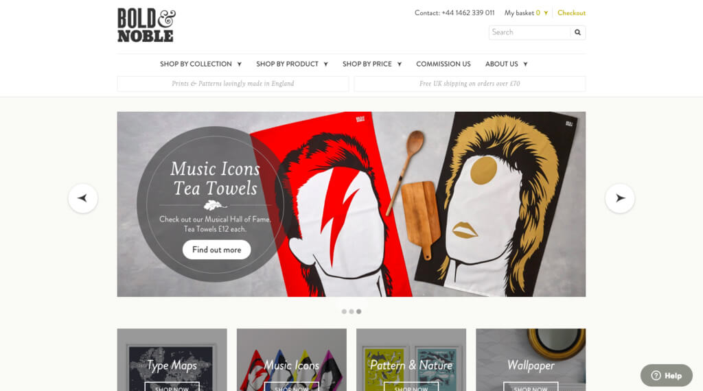
If you’re a fan of handmade crafts that are aesthetic and unique, then Bold & Noble is the website to go to – plus, they make themselves abundantly clear:

“Print and patterns lovingly made from England.”

And that’s what it says on the tin.

Not only is their navigation bar clean and neat, they’ve got all the relevant information (product, pricing, information, etc) all on the first page without overwhelming the user with their numerous collections.

The takeaway from them is this: be considerate of your customers and learn to prioritise what information is the most relevant.

If your content in the 2000s your bread and butter, then spruce it up. But if you have new content in 2018, then you might want to think about replacing the ‘centrepiece’ of your eCommerce website.

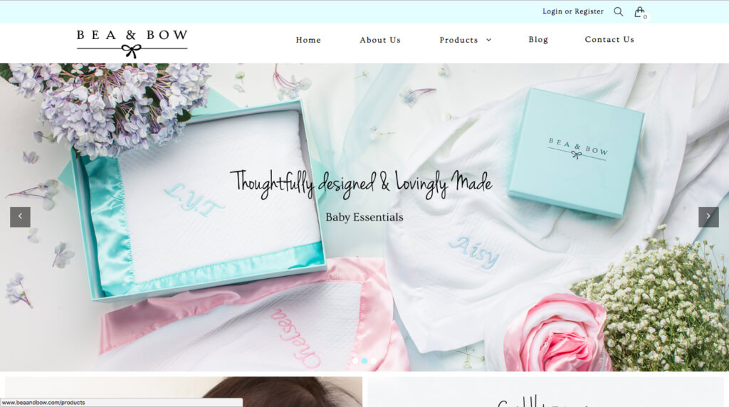
4. Bea and Bow
Here’s a bit of a disclaimer: we’re tooting our own horn, but for good reasons! We promise!

With soft pastels and luxurious looking baby products, Bea & Bow’s classy but fun aesthetic is what gets the user (read: us) suckered in at first.

See, their product catalogue is pretty on-the-nose – soon as you scroll down their webpage, you’d probably coo at the sleeping baby at the screen, then hone in on the actual message: ‘softest baby blankets.

That effective copywriting and straight-forward visual is what gets the message across to their intended audience, so that people know what they’re in for the first thing they click in to the website.

So, now that you’re inspired to create or improve your own website with these awesome examples, why not make the best out of your eCommerce website with designs specifically outfitted for your brand here?

Table of Contents

1. LOQ

2. 1-OK CLUB

Share this article

Related posts
Why Web Copywriting Is Hard and How to Fix It

An article for the scared, confused and clueless

Copywriting: this underrated part of web design has the power to take your website to the next level or ruin it. The rise of the value in consumer journeys has made website design incredibly important here – where the smallest error can chase your web traffic away. As one of the top digital marketing agencies in Singapore and Malaysia, we’re going to share some insights to clear up the confusion.

Read More
6 Trends in Web Design To Improve Your Website

As we ease ourselves into 2019, we couldn’t help but notice the plethora of website designs that have surfaced in the past months. With the abundance of information, good web design examples and website design tips found online, it is easy to identify the trends that can be adaptable across different brands.

In this digital age, identifying trends is important for any brand and this is even more evident in website designs. Users are exposed to countless online content daily – being behind the times or outdated affects your website’s user experience.

Hence, to help you to improve your website design, we’ve sniffed out some prominent trends that you can learn from:

Read More
Facebook AR Games To Threaten Snapchat’s Influence?

When Snapchat launched Augmented Reality (AR) games last month, it positioned themselves to take on the giants and move one step ahead of the competition.

However, it didn’t take long for the competition to fight back, as Facebook launched AR games in Messenger earlier this August.

Taken from Facebook Newsroom

The bout between these platforms will continue to benefit creative digital marketers as they continue to one-up each other and provide more and better tools.

So the age-old question follows, now what?

Read More
7 Digital Marketing Lessons From The New Maplestory M

As if phubbing wasn’t a deep enough problem in our digital-crazy era, a ghost from the past has come back to haunt us. Nexon released a mobile version of their heralded PC game globally, Maplestory M, on Wednesday, 25th July 1pm. Maplestory M started their page on May 14, garnering more than 200,000 followers since. It is probably the most successful launch of a mobile game since Pokemon Go. So what can we learn from this?

Read More

CONTINUE TO  EXPLORE