Rebranding is becoming a more common marketing strategy, which can range from changing business models to a simple logo rebrand. Whether it is to stand out from your competitors or to remove negative associations, rebranding is essentially executed with the purpose to change attitudes and perspectives.
Logo rebranding is a small aspect of rebranding, where brands revamp their logo by changing the name, typeface or visual icon to establish a fresh identity. While it can be simple, there have been questionable attempts that have occurred.
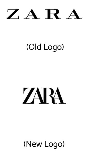
One recent example would be Zara’s recent logo change, that has raised a few eyebrows. By reducing the kerning of the logo, it became less appealing to users, akin to a ‘typography bus crash’.
That being said, there are successful logo rebrands out there that have drawn raves and positive reviews. If you are looking at a logo rebrand, here are our 4 favourite successful examples:
A Trillion Dollar Apple
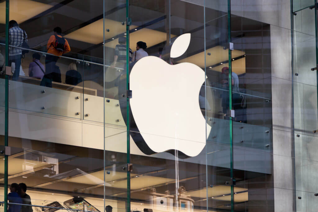
By transforming its rainbow-coloured logo into a grey-coloured sleek design, they kickstarted their “Think Different” campaign in 1997. Through a renewed focus on unique experiences and minimalist design, their logo rebrand accentuated the entire campaign itself.
Combined with the removal of fluff from the product, Jobs managed to communicate Apple to the masses. This logo also marked the start of the minimalistic era and the domination of the i-named products going into the new millennium, and thus, deserved to be on this list.
The Mastercard Name-Drop
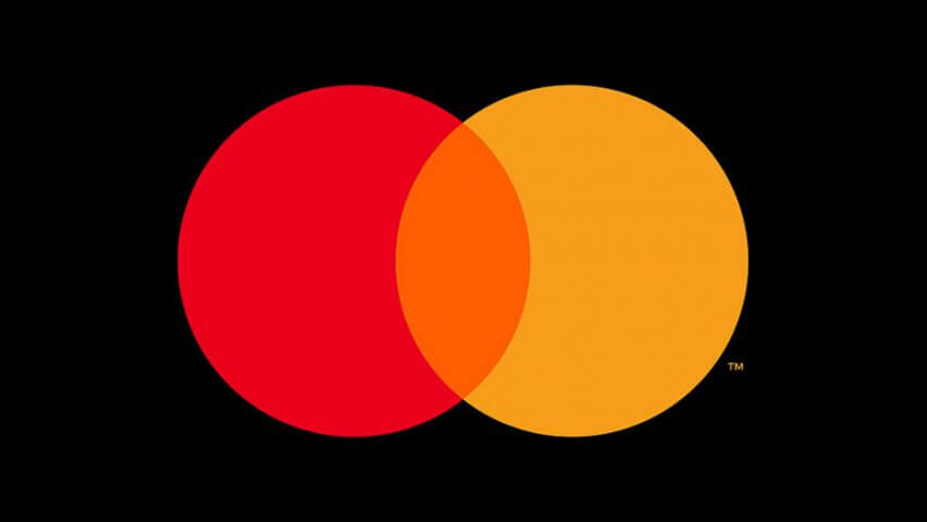
To mark their entry into the digital age, Mastercard dropped its name from its iconic logo just this January. With the ever-evolving marketing industry, Mastercard knew they had to keep up and took a simple yet chic take on its logo, that fit the simplicity in the aesthetics of today.
The logo has been an obvious key creative in their cards and the subtle move hit all the right notes. The removal of the words generated more room for creative adaptations and represented the trust in their brand’s recognisability.
Furthermore, it signifies more to come from Mastercard, as they take aim at the top spot amongst financial institutions. It would be wise to keep a lookout for more digital marketing strategies to follow.
Seeking an impactful digital marketing strategy for your brand? You will require the assistance of a top agency that is willing to take on your challenge.
Saint Laurent Drops The Yves
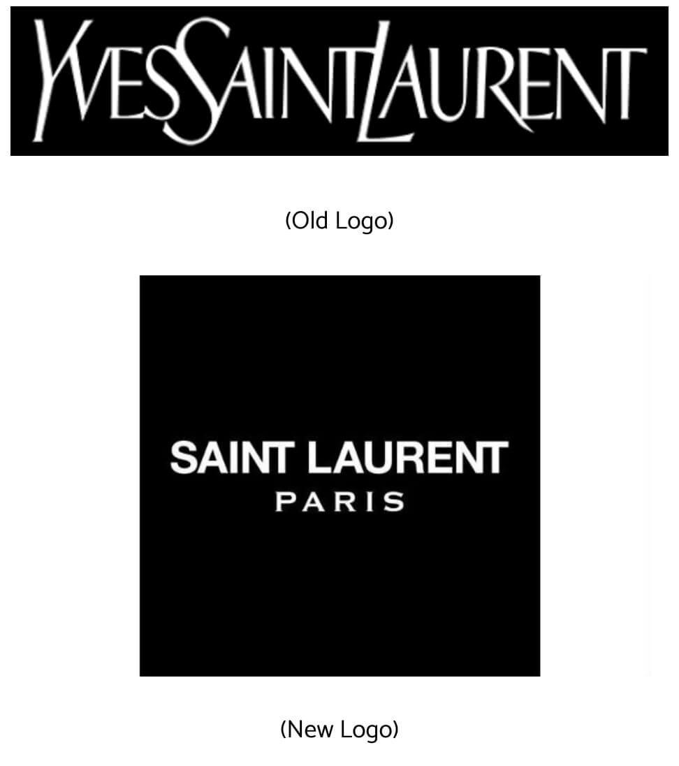
Yves Saint Laurent pulled off a logo rebrand in the complete opposite direction of Zara, by increasing the kerning of the logo and giving it a bolder and more recognisable look.
While seen as controversial at that time, the impression of the YSL logo rebrand has drastically flipped and drawn heaps of praises in recent times. The reduction of the logo’s length has made it easier to pronounce, which is important for word-of-mouth.
The change has also made it more readable and recognisable, which translates to much better application across its products. Essentially, it achieved the converse of what Zara has done.
Airbnb’s Meaningful ‘Bélo’
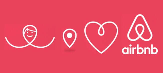
The team behind Airbnb took a new approach to its services in their 2014 logo redesign. By fully immersing in the experience of Airbnb, they came up with the tagline ‘Belong Anywhere’ and the ‘Belo’ logo.
They decided to shift their focus in constructing the ‘A’ to represent their brand. Through the new logo, it communicated their intentions to place their users at the core and managed to achieve much more.
With a fresh coat of impression, it successfully influenced people with a new concept of travel and hosting. As a result, Airbnb has since grown to house over 400 million guest arrivals worldwide, making Belo a globally recognised symbol of belonging.
Concluding Note
There is no one-size-fits-all solution to a successful rebranding campaign. Beyond a revamped logo, it is essential to identify how to transform the public’s perception of your brand within the work. Nonetheless, the above brands deserve their props for a job well done.
If you are looking to improve the image of your brand, whether big or small, talk to a creative agency that willingly accepts the challenge.
Table of Contents
A Trillion Dollar Apple
The Mastercard Name-Drop
Saint Laurent Drops The Yves
Airbnb’s Meaningful ‘Bélo’
Concluding Note


