WEBSITE
Overview
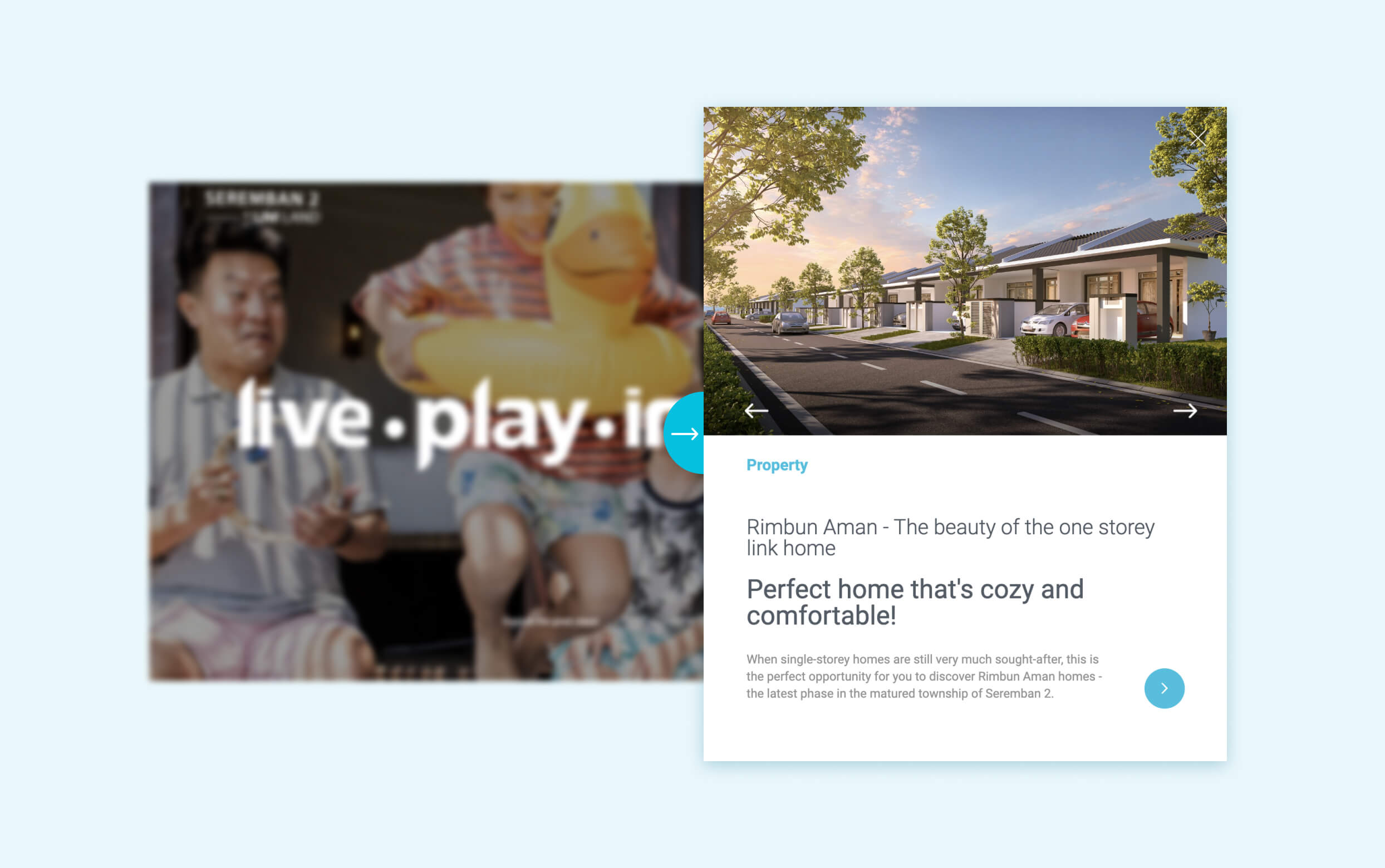
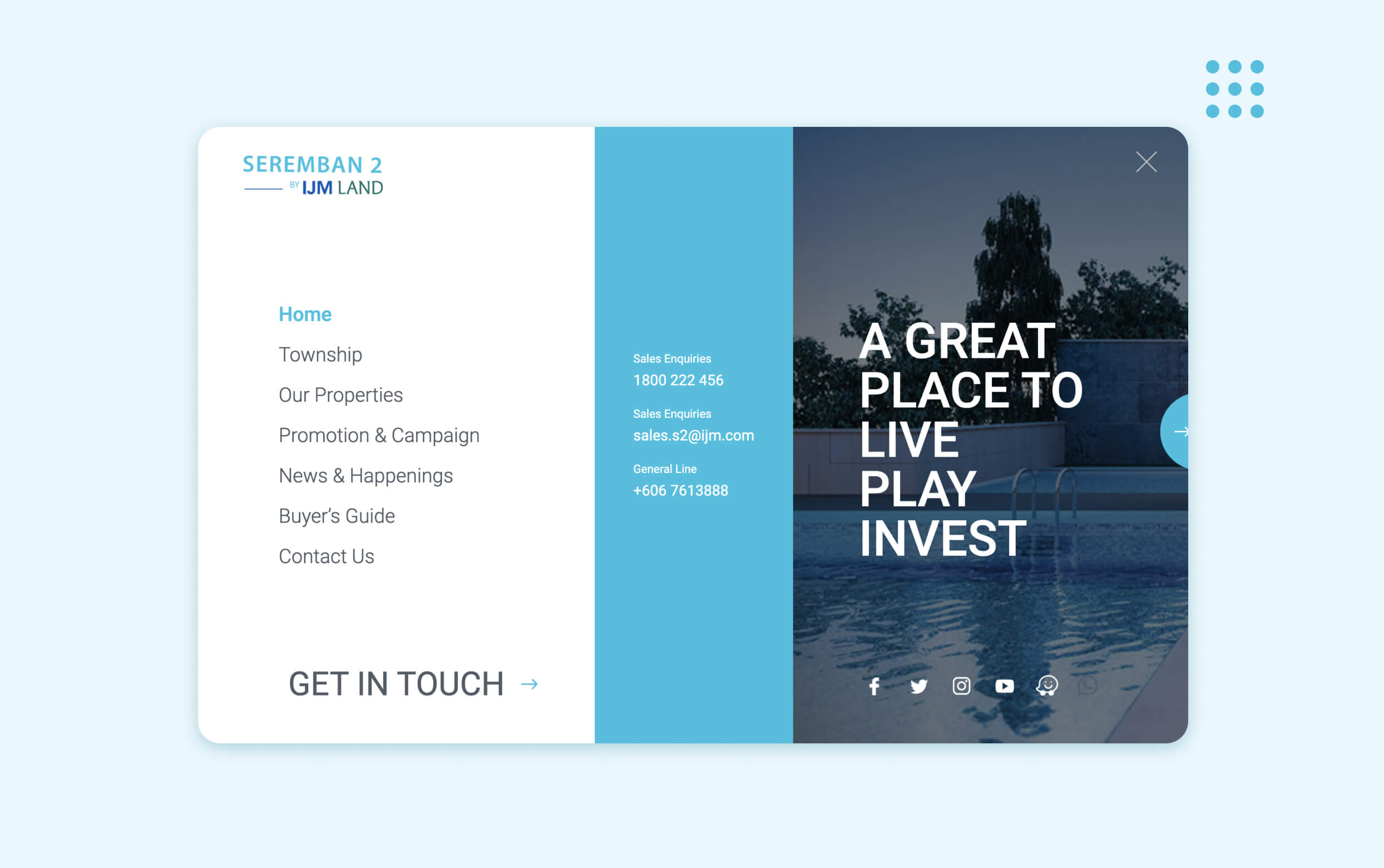
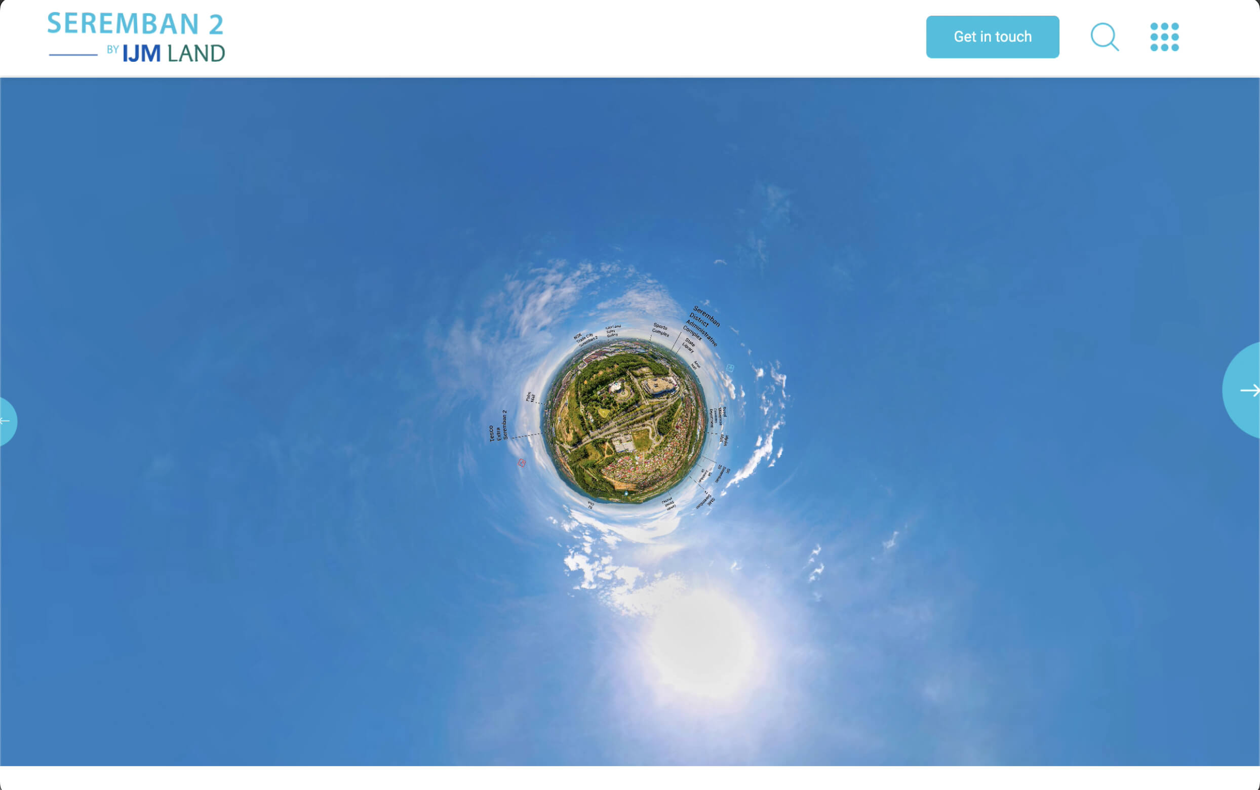
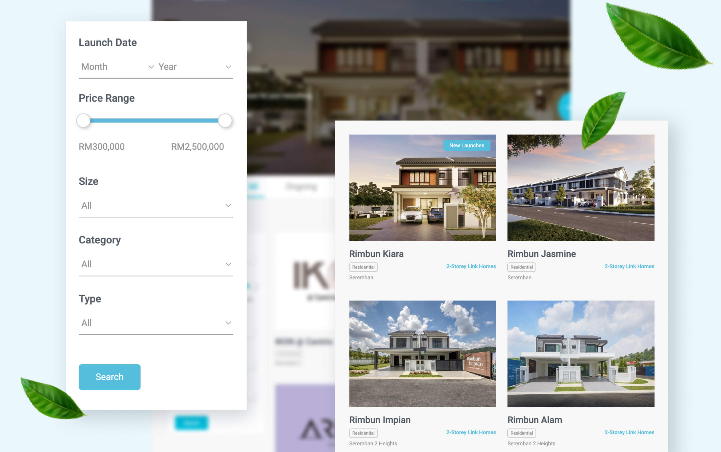
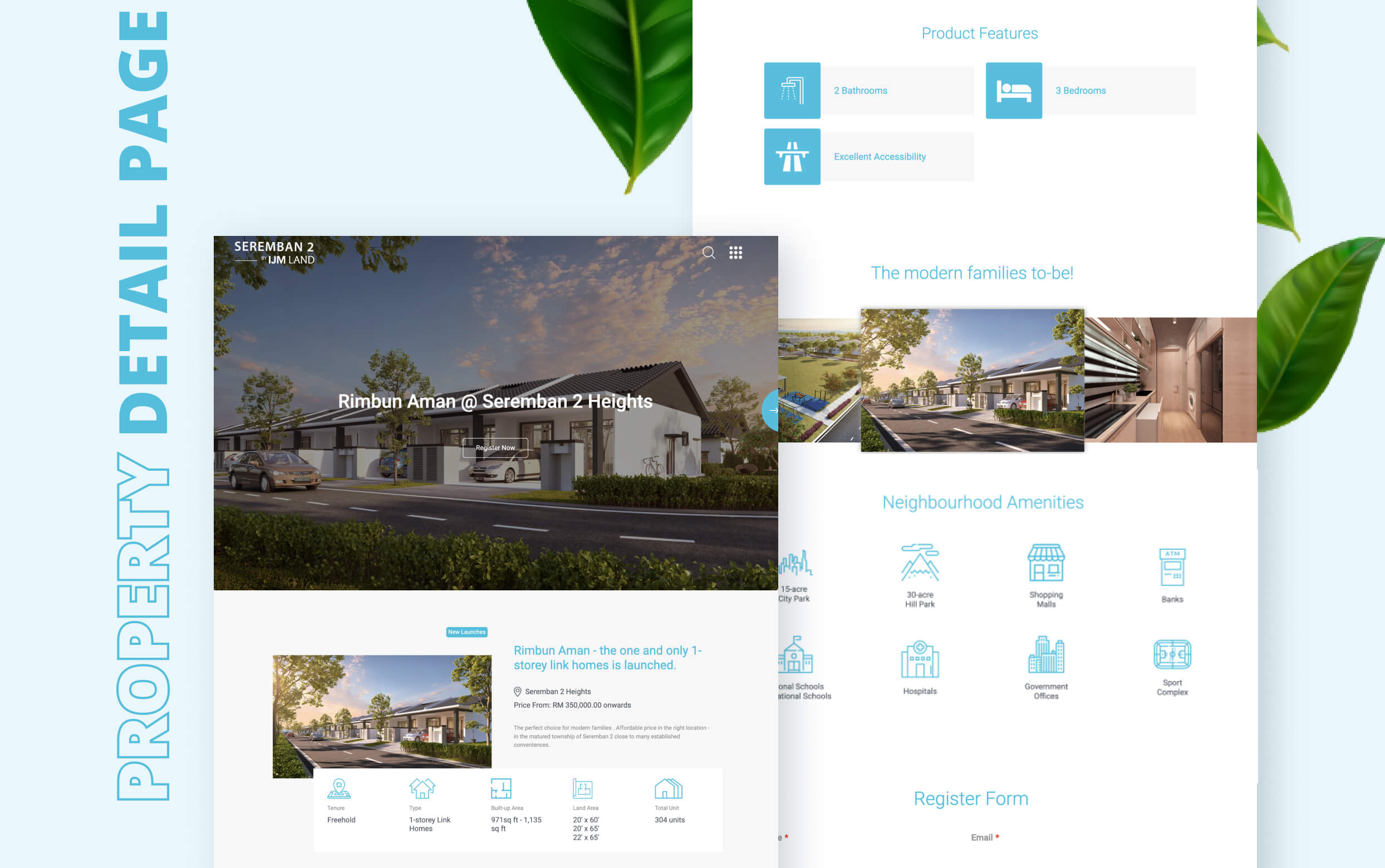
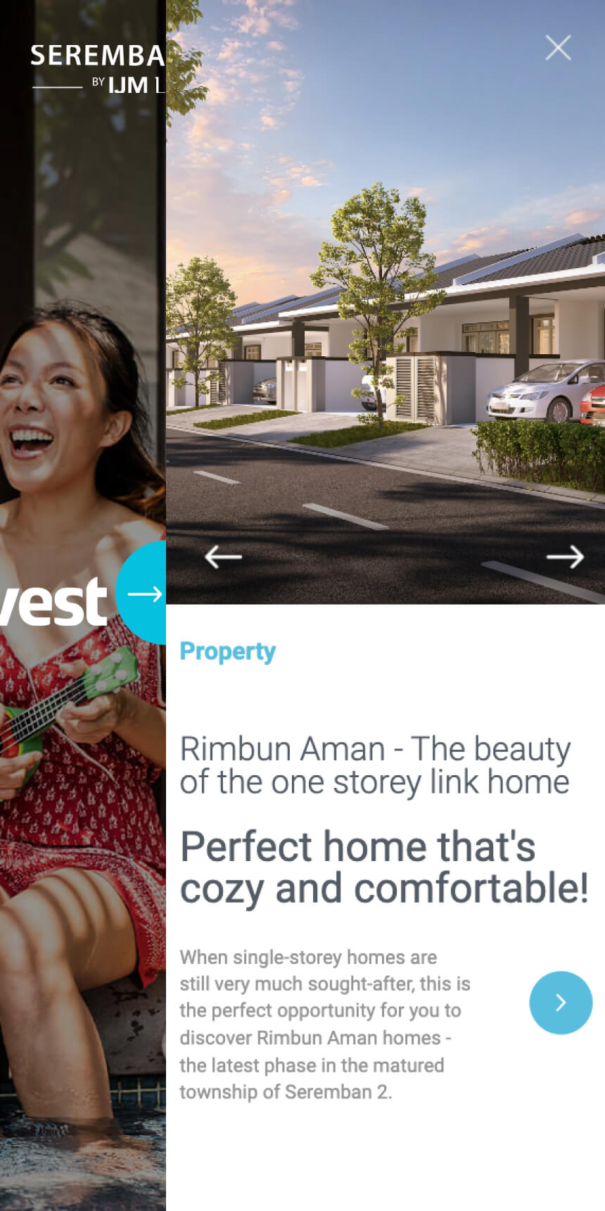
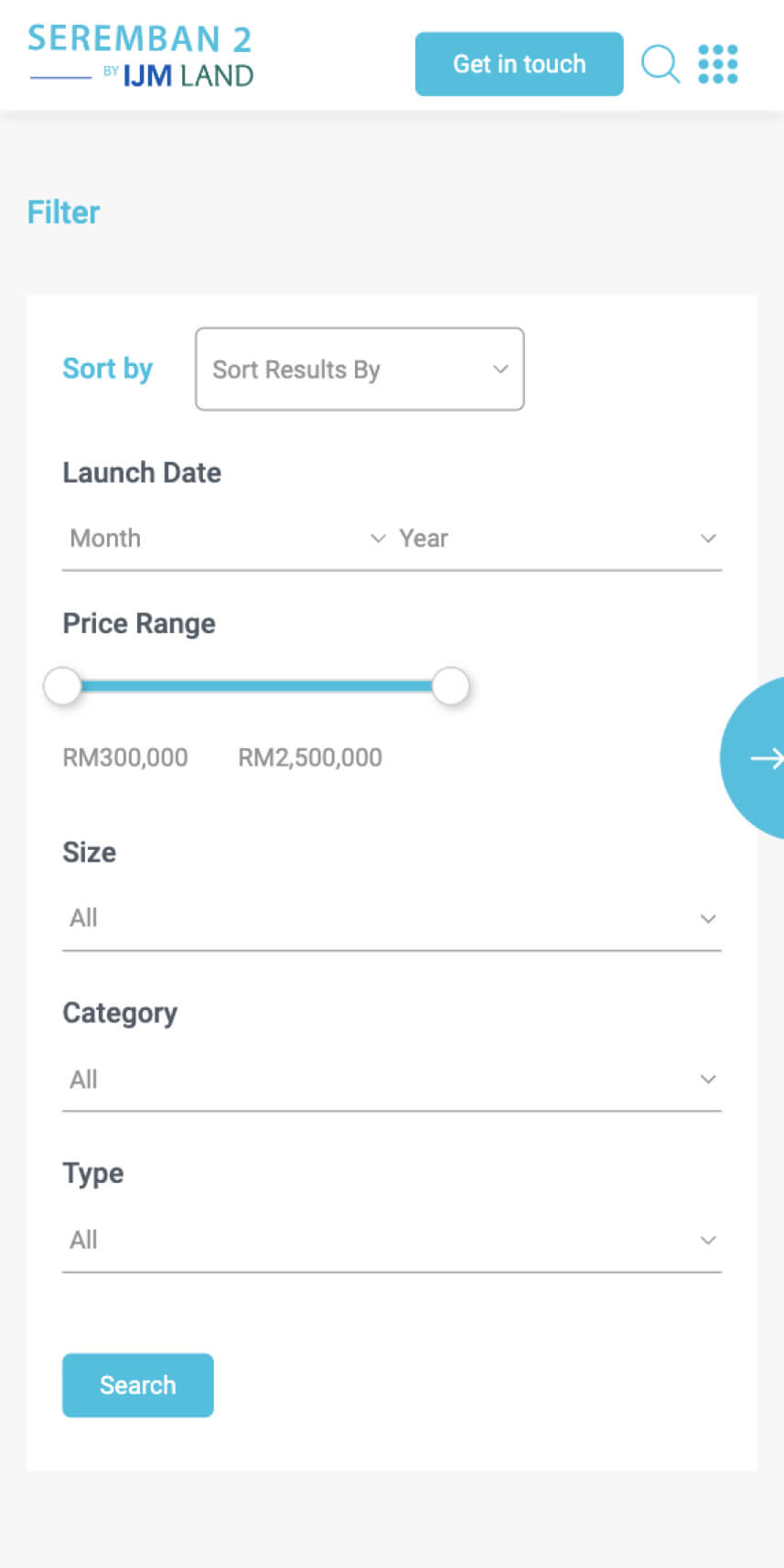
Through the branding exercise of this campaign, the positioning of this township is family-oriented community. Warm and sentimental set the tone of the overall creative. Turquoise is primarily used to portray modern bliss and tranquility while the secondary colour palette is naturally refreshing. Combining all elements together, we have set a new and exciting chapter for wholesome family living.


